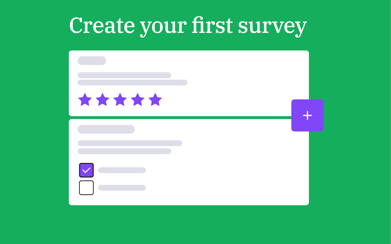
Hey everyone, As you may know, the new version of LimeSurvey is here! We made several changes to the user interface to improve the user experience. So we have been working on making the first steps in terms of stabilizing and improving the user interface. More enhancements are on the way, we will keep you posted. The following is the new UI design changelog for the latest version of LimeSurvey. We will update you on even more changes to the user interface and other new features in future articles. Below you will find the major user interface improvements to help you get started quickly and easily. Enjoy! “Create survey” shortcut in main navigation You just want to get going and cut to the chase? Great, just choose the first item from the main navigation and you’re ready to go. One click and you are exactly where you want to be, the survey section. Modals (Pop-Ups) All pop-ups in the application now have the same style and are built according to a certain structure to make the whole workflow more user-friendly. Page headers To get a better understanding of where you are in the application we have introduced green banners at the top of every screen of the application. Top bar The most important action buttons have been moved to the top bar and the amount of action buttons has been reduced to the essentials. Action buttons All action buttons are now styled in the same way and one specific action will always have the same icon associated with it for consistency. The most important actions are consistently positioned in the same location, to the left of the top bar. Furthermore, the most important action buttons have been moved to the left-hand side of all tables and we brought consistency in terms of icons, hovers, margins and the order of buttons. Additionally, small text balloons will appear when hovering over them, explaining the functionality of the concerning button. Tables All tables now have a new grid view class and are consistently styled and structured. You will find all buttons to help you see more information or make edits on the far left-hand side of the table. This helps you better manage your surveys, data and survey participants. Icons and small elements Three different icons for a single functionality like “Save”? No thanks! One icon is associated with exactly one functionality to make the design more accessible. The consistency makes for a better user experience. We also synchronized other small elements like dropdown-menu icons, page buttons of tables, main navigation elements and notifications. Pagination Under every table of the application you can now find consistent pagination to the far right-hand side. You can determine how many items you want your table to show you and, by doing so, customize your survey management. We hope you enjoy the new version! Now it is even easier to turn your questions into answers. We will update this changelog with more content whenever there are new elements to the user interface.More blog posts with specifics about these improvements and other changes to the user interface will follow in the upcoming period, so stay tuned. Have a nice day, everybody!
User Interface Design Changelog
Blog de encuestas
Blog oficial de LimeSurvey

- Detalles
- Categoría: Blog
Hey everyone, As you may know, the new version of LimeSurvey is here! We made several changes to the user interface to improve the user experience. So we have been working on making the first steps in terms of stabilizing and improving the user interface. More enhancements are on the way, we will keep you posted. The following is the new UI design changelog for the latest version of LimeSurvey. We will update you on even more changes to the user interface and other new features in future articles. Below you will find the major user interface improvements to help you get started quickly and easily. Enjoy! “Create survey” shortcut in main navigation You just want to get going and cut to the chase? Great, just choose the first item from the main navigation and you’re ready to go. One click and you are exactly where you want to be, the survey section. Modals (Pop-Ups) All pop-ups in the application now have the same style and are built according to a certain structure to make the whole workflow more user-friendly. Page headers To get a better understanding of where you are in the application we have introduced green banners at the top of every screen of the application. Top bar The most important action buttons have been moved to the top bar and the amount of action buttons has been reduced to the essentials. Action buttons All action buttons are now styled in the same way and one specific action will always have the same icon associated with it for consistency. The most important actions are consistently positioned in the same location, to the left of the top bar. Furthermore, the most important action buttons have been moved to the left-hand side of all tables and we brought consistency in terms of icons, hovers, margins and the order of buttons. Additionally, small text balloons will appear when hovering over them, explaining the functionality of the concerning button. Tables All tables now have a new grid view class and are consistently styled and structured. You will find all buttons to help you see more information or make edits on the far left-hand side of the table. This helps you better manage your surveys, data and survey participants. Icons and small elements Three different icons for a single functionality like “Save”? No thanks! One icon is associated with exactly one functionality to make the design more accessible. The consistency makes for a better user experience. We also synchronized other small elements like dropdown-menu icons, page buttons of tables, main navigation elements and notifications. Pagination Under every table of the application you can now find consistent pagination to the far right-hand side. You can determine how many items you want your table to show you and, by doing so, customize your survey management. We hope you enjoy the new version! Now it is even easier to turn your questions into answers. We will update this changelog with more content whenever there are new elements to the user interface.More blog posts with specifics about these improvements and other changes to the user interface will follow in the upcoming period, so stay tuned. Have a nice day, everybody!

- Detalles
- Categoría: Blog
Hey everyone, It has been quite some time since you have heard from us! We have been working on lots of improvements for LimeSurvey. We are back with great news:Over the past few months we have taken your feedback and improved our survey tool. Not all of it but we are quite on our way and making steps in the correct direction. In the upcoming weeks we will detail the main improvements we have been working on. Below the main highlights, including: Encryption: this can be activated for survey participants and responses on a field-by-field case to store sensitive personal data securely.Available in each question settings Question Themes: uploading and installing of your own question themes.Configuration --> Themes --> Question themes User roles: introduction of user roles for your surveys.Configuration --> Users --> User roles ExpressionScript: many new functions for ExpressionScript used to support more complex branching, assessments, validation, and tailoring of questions. User interface & user experience: optimizations and improved consistency. Besides the highlights mentioned above there is a lot more to discover. Below you find an overview of our new features: Global settings Maintenance mode: Surveys can now be put into maintenance mode using the new global maintenance feature. Configuration --> Global --> General User administration email templates: There are new email templates available when adding users to your survey site. Configuration --> Global --> User Administration Survey participants There is a new access code (token) plugin that allows you to specify the exact format of the access code. Configuration --> Plugins --> customToken --> Click on "activate plugin" Security Email SMTP passwords are now saved encrypted in the database. Random passwords are no longer sent to participants. Reset links are used instead. Configure rules for password strength: Also you can now configure the rules for your password strength by using a plugin. Configuration --> Plugins --> PasswordRequirement --> Click on "activate plugin" Survey themes You are now able to do the following: revert theme files to default define dropdown options batch reset or uninstall survey themes configure how to handle question types in the frontend on smaller devices displayed in tables. If the "NoTables" plugin is activated then it fits the table to the smaller screen.Configuration --> Themes --> select e.g. LimeSurvey Fruity Theme --> Theme options Also, LimeSurvey 3 themes are converted to a new theme format automatically. ExpressionScript statCount & statCountIf. There are new functions that make it easier to evaluate survey results. There is a new function to convert a number or text into a float value ( floatval() ). We have implemented a new placeholder to use the SEED valueConfiguration --> Plugins --> expressionFixedDbVar --> Click on "activate plugin" We have implemented a new placeholder to access the question help text.Configuration --> Plugins --> expressionQuestionHelp --> Click on "activate plugin" You now can get the question text of multiple choice and array questions via questioncode.question. Configuration --> Plugins --> expressionQuestionForAll --> Click on "activate plugin" Export The output of graphs in PDF statistics exports has been enhanced. Permissions Now you can assign a role to a user instead of individual permission for easier user role and permission management. Configuration --> Users --> User roles You can allow an administration user to update the script by enabling an XSS filter. Configuration --> Global --> Security It is now possible to allow the insertion of videos by enabling an XSS filter. Configuration --> Global --> Security There’s a new “Select all" choice when editing survey permissions. Surveys --> Your survey --> Survey settings --> Survey permissions Survey groups We have implemented a new permission system for survey groups that allows you to assign individual permissions for certain survey groups. Surveys --> Survey groups --> Edit survey permissions Emails Now you can configure the sending rate of your invitations and reminders. Configuration --> Global --> Email settings Question types/ editing There is a new configurable prefix for sub-questions and answer options in personal settings. Your username --> My Account --> My personal settings A new placeholder setting for text questions and numeric questions has been added.Surveys --> Your survey --> Structure --> Add question (text question) Now you can save your question settings as default question type values to speed up the creation of similar questions.Configuration --> Global survey --> General settings Use the textarea for sub questions via ExpressionScript. Sub questions are found at the bottom and the text areas are useable via ExpressionScriptSurveys --> Your survey --> Structure --> Add question See the relevance of your group (if you set any) in the question view.Surveys --> Your survey --> Structure --> Group summary (click on a question group) There is a new lock organizer in the sidebar of the application.Surveys --> Your survey --> Structure (Lock icon) You will now see a warning message when you try to activate an expired survey. Use the new “soft mandatory prompt” to remind a participant to fill out a question The participant may still proceed without doing so.Surveys --> Your survey --> Structure --> Add question --> Settings (Soft mandatory) Question themes It is possible to install a question theme by using a zip file upload.Configuration --> Themes --> Question themes You can now disable a question theme.Configuration --> Themes --> Question themes Export SPSS as a sav file Configuration --> Plugins--> ExportSPSSsav New question types There are lots of new question types, including: Mask Questions: Advanced Ranking Multiple choice questions: Image Select Multiple Choice Single choice questions: Image Select List (Radio) Bootstrap Button Text questions: Browser Detect Input on Demand Sharing panel Once you have activated your survey you can pick a channel to distribute it and start collecting responses. Channels you can choose from: Anonymous link QR code Social mediaSurvey settings --> Overview --> Sharing panel We hope you enjoy the new version! Now it is even easier to turn your questions into answers. More blog posts with specifics about these improvements will follow shortly, so stay tuned. Have a nice day, everybody!

- Detalles
- Categoría: Blog
We want our users and our community to feel safe and protected when working on and with our online survey software, which is why we will expound the essentials you need to know in terms of laws, measures, and security associated with data gathered by LimeSurvey. There are different legislative levels involved in the bigger picture of data security that LimeSurvey is subject to. Federal Data Protection Act (Bundesdatenschutzgesetz, BDSG) Starting at the organisational level, on which LimeSurvey receives data input from any potential user, data security and privacy have to be ensured by orders of the superior federal state level, i.e., the respective legislation of any of the 16 federal states in Germany. However, these multiple federal state data protection laws have to coexist with regulations on the country level, the Federal Data Protection Act, which was first introduced in 1978. You can read the details of the Federal Data Protection Act here. Any German organisation such as LimeSurvey has to adhere to any data security regulations dictated by the Federal Data Protection Act and the federal state laws. The Federal Data Protection Act is further connected to European regulations. European Data Protection Directive 95/46/EC The Data Protection Directive 95/46/EC was adopted by the European Union in 1995 in order to regulate data processing and laws within its member states. It serves to specify and dictate minimal data security requirements that each member state is to incorporate into internal law. In fact, by 1998 all member states had created their own data protection laws according to the European Data Protection Directive, including Germany. You can find out more about the European Data Protection Directive 95/46/EC here. General Data Protection Regulation (GDPR) The General Data Protection Regulation is a new data protection regulation drafted by the European Union and will replace the previously existing European Data Protection Directive, as well as the German Federal Data Protection Act, and will, therefore, directly impact German laws on data security, including measures undertaken by LimeSurvey to keep users' data safe. The GDPR was implemented on 25 May, 2018 and aims at strengthening data protection throughout the EU by unifying regulations incorporated into national law of all member states. Thus, data security policies will assimilate in the future across countries in the European Union. The goal is to increase data security by standardising regulations within an established and dynamically cooperating inner-European market. The reason for this radical shift of EU regulations is founded in increasing data abuse possibilities due to expanding cloud computing and big data efforts prevalent among organisations in all areas nowadays. You can find out more about the European General Data Protection Regulation here. In Safe Hands with LimeSurvey Any data collected and processed by LimeSurvey is done strictly within the legal requirements. We are an Open Source organisation that thrives on our great community without forcing or restricting anyone's use of our online survey software. The community can only keep growing safely if data protection is ensured at all times, which is the most valuable user right in the eyes of the LimeSurvey company. LimeSurvey neither discloses any user data publicly, nor transfers any user data to any third party without an explicit consent. It has always been this way and will always remain this way.

- Detalles
- Categoría: Blog
This segmentation which precedes any personalised addressing of customers requires defining the criteria to segment by, such as demographic data in order to better determine who your customers or prospects truly are. If you are running a survey with one of the aforementioned target audiences, it is vital to ask the right demographic questions in order to maximise your understanding of this data. In the following sections, we will take a look at the best demographic questions to ask and how to ask them in surveys. What Demographic Data to Collect in Surveys Naturally, not every survey should contain all conceivable demographic questions. The process of selecting and writing demographic questions is always strongly case-dependent and should be chosen based on research strategy and goals. Therefore, make sure to explicitly define the purpose of your data acquisition beforehand and you will be on the right track. Nevertheless, a certain basic set of demographic data will always be helpful in segmenting survey research data in order to get to know your main prospects or customers. What is your age? The art of asking about a respondent’s age is balancing the level of data detail as well as avoiding survey fatigue, i.e., grouping individual ages into ranges leads to fewer answer options, improves readability and possibly lowers response fatigue. How finely you choose to distinguish between age groups should be tested for comparison of response rates. It is important to work with a single choice question format such as a radio list question type, as these answer options need to be mutually exclusive. Also, make sure that your age ranges don’t overlap, otherwise your data evaluation will be difficult. Here’s an example of how you could structure the question: o Under 18 years old o 18 – 24 years old o 25 – 34 years old o 35 – 44 years old o 45 – 54 years old o 55 – 64 years old o 65 – 74 years old o 75+ years old What is your gender? Asking about a person's gender has become an increasingly sensitive topic, as apart from male and female gender attribution, multiple alternative gender descriptions have arisen recently that have been recognised as official gender statements. LimeSurvey offers a prebuilt button style or radio list gender question type. It, however, only includes male and female as answer options so far. If additional gender options are to be included, a simple radio list question type will do. Also, a simple open-ended question type can be used to give respondents the ultimate freedom in choosing their gender identification. Here’s a preview of possible questions regarding the sex/gender of your test person: What is your sex? o Female o Male What is your gender identification? o Male o Female o Other: What is your marital status? Learning about respondents’ marital status is often one of the less important demographic questions, as this segmentation does not usaually deliver significant value to the majority of most businesses. Nevertheless, there are plenty of benefits of gaining information from this data, especially since it is a fairly straightforward question. It makes sense to enable multiple choice question types in this case, as a combination of answer options is possible, e.g., someone who is single could also be recently separated from a meaningful relationship.Here is an example of how to ask for marital status: Single Married or domestic partnership Widowed Divorced Separated Other How would you specify your ethnicity? Questions about ethnicity, race or origin are highly sensitive in nature due to conflicts and crises that have shaped society through past events and prejudices. Nevertheless, the data derived from this question is popular to segment survey responses in order to derive trends and patterns in regard to cultural impact. As this is not a mere aspect of documentation, but also based on belief systems and emotional identification, you should use a multiple choice question type to help ensure that respondents have multiple options to choose from depending on how they identify. This example could be used as a template for the question: African American White Hispanic or Latino Native American Asian Other What is the highest educational level you have acheived? Receiving data on respondent’s qualifications is a great way to analyse educational impact on answers given in your survey.Make sure to provide a complete and distinct list of qualification levels here to cover any possible situation. Usually, answer options involving degrees can be thought of as mutually exclusive, as they build on each other in a hierarchical structure when asking about specifying the highest qualification, so you should use a radio list question type here. o Less than high school or secondary school degree o High school or secondary school degree o Bachelor's degree o Master's degree or diploma o Doctorate o Other What is your annual gross household income? Similar to the age question presented above, income questions can face the problem of survey fatigue depending on how detailed, and thus how many answer options are presented at once. Categorising income in ranges will again help reduce the available options and make it more transparent. Make sure to use a currency that is reccognized globally to improve comprehensibility and comparability of answer options, e.g., U.S. dollars or EURO. As money is always a sensitive topic, it is recommended that if you are not in desperate need of this data to make the income question a voluntary one, as many people do not like giving information on their personal finances. o Less than €30.000 o €30.000 to €49.999 o €50.000 to €69.999 o €70.000 to €89.999 o €90.000 to €99.999 o €100.000 or more What is your current employment status? If you are questioning a wide variety of people, getting information on their employment status can be very interesting and valuable. The difficulty with this question, however, is to provide all possible occupational statuses. Listing a few common ones and offering an Other option, however, should solve the problem. Make sure to use a multiple choice question here since people can have different occupational statuses at the same time, e.g., a student can also be employed part time or self-employed. Employed full time (40 or more hours per week) Employed part time (up to 39 hours per week) Unemployed Self-employed Unable to work Retired Student Other Which industry do you work in? This is an optional question and obviously will only be relevant if the aforementioned question was answered with a full time, part time or self-employment response. This is also a tricky one, as you may use a single or multiple choice question type and have a very long list of industries which may lead to survey fatigue, or you could offer an open-text question which will significantly increase the amount of time it takes to complete the survey. A great approach here would be to create a question that works with search recognition, a hybrid of the aforementioned options in a manner that allows the respondent to start typing in an open-text field, and based on this, offers predefined answer options that will standardise the results to be evaluated later on. This, however, will require coding expertise. Leverage the Value That Demographic Data Can Deliver The key to obtaining the maximum benefit from demographic data is contingent upon two aspects: Firstly, you need to align your questions with your research goals and strategy by choosing the necessary demographic questions and phrasing them in a way that they are appropriate and meaningful. Secondly, you need to make sure not to overload your respondents with too many demographic questions at the same time. So you have to find a good balance between getting enough data for your research requirements and not having too many questions, which might cause your respondents to abandon your survey before completion.

- Detalles
- Categoría: Blog
Take a look at the following assortment of the most popular and widely used chart types to get a good idea for evaluating and reporting on your own survey data. When to Use a Pie Chart single choice questions mask questions (e.g. Gender, Yes/No) Pie charts are best used when you are presenting a share of something, ideally items explaining a single variable to benefit readibility and assessment. Logically, all shares in a pie chart should thereby add up to 100%. For example, when you have binary survey responses, e.g., yes/no question types, or questions with only a few answer options/categories. Overloading a pie chart with too many categories, i.e., 6 or more, makes it hard to identify labels as well as shares and should be avoided. When it comes to data types, nominal data such as demographics, i.e., data without an order or ranking, as well as ordinal data such as likert scale ratings, i.e., data with an order or ranking, can be visualised using pie charts. Nominal data can be arranged clockwise from largest to smallest share and ordinal data can be arranged clockwise according to ranking or rating scale. In order to increase distinction between shares in a pie chart, strong colour contrasts or colour shades can help to achieve this. Pie charts are a nice and visually appealing solution if you are trying to show general trends rather than specific accurate data. General Tip: Avoid including "Other" as an option choice, as an answer as different responses will not be displayed in a pie chart, but will be shown as "Other". When to Use a Donut Chart single choice questions mast questions (e.g. Gender, Yes/No) Donut charts work similarly to pie charts. Donut charts have a circular cutout in the middle whereas the shares within pie charts completely fill out the middle. Despite these seemingly small differences, the way these chart types are viewed and interpreted from a psychological standpoint vary substantially. Shares of a pie chart all run to the middle and focus a viewer's attention to the centre where all pieces are processed as by the size of their areas. Shares of a donut chart however focus the viewer's attention to the length of each piece, thereby demonstrating a more linear approach of processing results. The latter way of interpreting data is naturally easier for people. Apart from that, donut charts can be used in the same way as pie charts, i.e., assessing shares of a whole. When to Use a Bar Chart single choice questions multiple choice questions arrays mask questions (e.g. Gender, Yes/No) There are several different ways to visualise data with bar charts. Most commonly used are the vertical and the horizontal bar charts. Both vertical and horizontal bar charts are composed of columns which are either aligned vertically or horizontally to the x-axis respectively. Furthermore, they are suitable to visualise nominal and ordinal data. The vertical bar chart is helpful when displaying percentages or means of only a few categories. Otherwise, too many categories would increase the width of the entire chart across a screen and make it hard to read or even display. Rule of thumb here is to reduce categories included in a vertical bar chart to only about a handful. Compared to pie charts, bar charts facilitate direct comparison between categories, especially when ordinal data is arranged from largest to smallest column or vice versa. Furthermore, bar charts can easily display negative values which is impossible with pie charts and makes the former superior and more flexible in most cases. The horizontal bar chart comes in handy where the vertical bar chart falls short. If you have more than a handful of categories, select the horizontal bar chart as it extends vertically and improves readibility. Stacked and grouped bar charts are great solutions when displaying subcategories, i.e., break down categories for a more detailed view of your data. The only difference between stacked and grouped bar charts is the way subcategories are displayed, namely subcategories in the same bar versus in different bars. General Tip: Make sure to display your bar labels horizontally, otherwise viewers have to tilt their heads to read them. Also, don't include the answer option "Other" for the same reason disclosed for pie charts. When to Use a Line Chart Single choice questions Multiple choice questions Arrays Mask questions (e.g. Gender, Yes/No) Line charts consist of data values that correspond to individual answer options and are best used to display trends, comparisons or peaks over time, therefore are great when running surveys repeatedly. General Tip: Reduce the number of labels on the x-axis to a maximum such as 5 to ensure readibility; however, make sure to have enough data points to enable proper extraction of trends. Also, adjust the relative height of the y-axis to match your highest value point within the line chart to improve the visual appeal of the chart. Furthermore, do not include the answer option "Other" for the same reason disclosed for pie charts. Chart Types in LimeSurvey In LimeSurvey, for each question that is created in a survey a chart type can be predefined in the statistics options of the respective question. If not changed, it will be set to bar chart by default. Not to worry though, in the statistics overview after collecting survey responses, you can simply and flexibly switch back and forth between all available chart types. Besides bar, pie, donut and line chart, LimeSurvey offers a few more chart types that are not as mainstream: radar (spider) chart and polar chart. Radar charts are a great way of visualising multivariate data, i.e., data with multiple variables, on two dimensions while the variables are represented by axes starting from the same point. Thus, radar charts are beneficial when other chart types such as bar charts become rather cluttered with an increasing number of variables. Polar charts are essentially radar charts since both display data as circular graphs and can be used nicely for visualising multivariate data. However, while radar charts connect the variable results to a "web", the polar charts display results in adverse bars within the circular diagram. General Tip: Keep the number of variables in your radar or polar chart to a maximum number of 8 to avoid chart overload and confusion. Advanced Tip: If you are dealing with large amounts of survey data in general, we recommend you consider creating pivot tables to get more efficient and structured data filtering options when generating flexible and powerful pivot charts. Conclusion Learning how to use these different chart types effectively will be of great benefit not just when presenting survey results, but also and more importantly when deriving actionable measures from these results. It is always important for you to consider that your audience may not be familiar with the survey setup, i.e., structure, variables and items in detail, which makes it essential to facilitate the readibility and interpretation of your survey results by choosing the most suitable chart to get your point across. Always remember: There is no one right chart to visualise your survey data. It ultimately comes down to weighing the pros and cons of each chart.

- Detalles
- Categoría: Blog
It is said that the NPS value is heavily linked with revenue growth and, therefore, a key metric to establish customer loyalty by a provider of a product or service. The Net Promoter Score consists of a single powerful question that simply asks “How likely is it that you would recommend company/product/service XYZ to a friend or a colleague?”. It offers an array of answer options ranging from values 0 (“Not at all likely”) to 10 (“Extremely likely”). It was developed by Fred Reichheld and introduced in 2003.* How to calculate the Net Promoter Score First, your survey respondents are divided into three groups: Those that chose answer options 0 to 6 are categorized as detractors, i.e., people who are not particularly satisfied with your products or services. Respondents who chose 7 or 8 are labelled passives who are neutrally motivated users and later ignored when calculating the Net Promoter Score. Lastly, those who chose 9 or 10 are your promoters, i.e., your loyal and satisfied customers who would gladly recommend your company and its products and services to other people. The actual NPS calculation is done in two steps. First, you need to determine the percentage of promoters and detractors: Number of promoters / Number of total respondents * 100 Number of detractors / Number of total respondents * 100 Example: You have received a total of 100 responses on your survey. 30 respondents (detractors) chose 0 to 6, 30 respondents (passives) chose 7 and 8 and 40 respondents (promoters) chose 9 and 10. 40 promoters / 100 total respondents * 100 = 40% promoters 30 detractors / 100 total respondents * 100 = 30% detractors The second calculation step is the respective NPS equation: % promoters - % detractors = Net Promoter Score The Net Promoter Score can reach a maximum value of +100(%) if you receive 100% promoters and 0% detractors and passives or a minimum value of -100(%) if you receive 100% detractors and 0% promoters and passives. Let’s take a look at our previous example and calculate the Net Promoter Score. Example: We had 40% promoters and 30% detractors. 40% promoters – 30% detractors = 10(%) Net Promoter Score Note: There is broad uncertainty about whether the Net Promoter Score is displayed as a percentage or not. The fact is, there is no specific evidence so far to determine which is better. However, there are publications by the inventor of the NPS himself, Fred Reichheld, who specifies the NPS in percent, for example, see here which is why I decided to stick to percent. What is Considered a Good Net Promoter Score? This question is not easily answered or assessed in a standardised way despite being purely numeric in determination. As mentioned before, the NPS can range from -100 to +100. If you have an equal number of promoters and detractors, you will always end up with an NPS of exactly 0. Therefore, it makes sense to treat 0 as the mean NPS, making it an average score, neither very good nor bad. Anything below 0 should sound an alarm, since it indicates customer satisfaction levels are tending towards negative values, and an organisation’s products, services or processes require considerable improvement to avoid substantial customer churn. Obviously, strategy and efforts should be aimed at achieving the highest possible positive NPS score. According to global NPS standards, a score from 0 to 49 is considered “good”, a score from 50 to 69 is considered “excellent”, while a score of 70 and higher is considered “world class”. For benchmarking reasons, pages such as Customergauge.com offer great insights into well-known brands’ NPS results. For example, Tesla Motors currently has an NPS of 97, while Apple has an NPS of 89, Samsung, however, only manages an NPS of 70. Interestingly, the Apple iPhone has an NPS of only 55 and the Samsung Galaxy only 45, hence, making the overall brands more satisfactory from a consumer perspective than the companies’ products. Tip: If you are able to retrieve information on competitors’ or industries’ Net Promoter Scores, this may give you a good starting point to work towards gaining a competitive edge. Advantages and Disadvantages of the Net Promoter Score There are plenty of advantages of conducting a Net Promoter Score survey to gain knowledge on how satisfied your customers are: Setup and processing are easy and fast due to user-friendliness. NPS question is intuitive for most respondents. Shortness of survey reduces survey fatigue and results in better response rate. Studies by Satmetrix and Bain & Company have shown that NPS and revenue growth are correlated. There can be good benchmarking possibilities. Customer classification can be undertaken easily. There are also disadvantages to the Net Promoter Score: It is criticized as being too general and unspecific, as it doesn’t reflect the reasons for low satisfaction of the detractors. It’s a snapshot of the general satisfaction level, but lacks natural motivation and plan what to do with the attained data. It fails to predict future loyalty trend. Tip: if you feel you are not getting enough information out of your NPS question data, simply extend your survey by questions such as ”Would you elaborate on why you chose {0,1,2,3,4,5,6,7,8,9,10}” and ”Which changes would have to be implemented regarding company/product/service XYZ in order for your recommendation to increase by just one point?”, each with an open text box. These additional questions extend your NPS status quo by asking customers specifically for improvement areas and enabling concrete action to spur growth. LimeSurvey offers a Net Promoter Score Survey Template which includes the aforementioned questions. Since it’s a template, it is fully editable and serves as a general survey framework. If you want to give us feedback, comments, or suggestions regarding our Net Promoter Score survey template, feel free to send us an email. *Net Promoter Score is a trademark of Satmetrix Systems, Inc., Bain & Company and Fred Reichheld

- Detalles
- Categoría: Blog
The evolution of surveys has kept up with the development of technology: going from door to door, mailing questionnaires out, calling people to complete phone interviews, using portable computers – and finally online surveys. Online surveys provide some obvious advantages such as reduced paper and administration costs. However, it makes sense to look a bit deeper into the differences between the two general options, online and offline surveys, especially with respect to the quality of the collected data. Quality of data The quality of survey results is made up of the right questions, representativeness of the examined group of interest, and the validity and depth of the answers. Error in your data can occur systematically due to biases, like researcher bias, survey bias, respondent bias and non-response bias, or randomly by misrepresentation. But it’s not just the accuracy of the data: Especially when surveying feedback on customers or an event experience or gathering new ideas and suggestions for improvement, the quality of free text fields are crucial for usable data. All those aspects are notably influenced by your choice of survey format. Response time and rates Online surveys most certainly produce quicker responses, since you can share the link to your survey immediately after creating it without having to call people, mail it to them or meet them in person. Offline surveys, on the other hand, usually produce higher response rates with in-person surveys being the most effective, followed by mail surveys. Online and email surveys still have a better response rate than telephone surveys. The height of response rates doesn’t necessarily translate to representation: If you want to represent the whole population of one country, you’ll need a much lower response rate than when you wish for feedback from a defined group. In a smaller group, you’ll get much smaller sample sizes and it’s much more likely to miss neutral responses and get more positive and negative results. Target group selection Most of the time, the lower response rates of online surveys can be compensated by being able to reach more people – even worldwide if you wish. With the right software you can run a survey in multiple languages of which the participants can select. If the survey has a specific target group or needs a certain frequency distribution in order to be representative, quota setting is a solution that can be used in survey software. A downside to online surveys is that random sampling is more difficult, since generating random email addresses like with phone numbers is not possible. That is not a problem if the group of interest consists of the members of a club, the students of a certain university, or registered customers to a shop. Otherwise panel companies can offer a solution to getting the wished sample size. The benefits of offline interviews include going to specific places after an event to reach specific people and also reaching the computer-illiterate population. Though the “online population” used to have special characteristics like being younger, better educated and more tech-savvy, the computer literacy has drastically increased in the last 15 years. Online surveys are thus reaching more and more people, whereas phone surveys, being still a popular medium of choice, are reaching less and less people, since households that have no landline are increasing, in particular with younger people. (Perceived) anonymity Especially upon addressing sensitive topics like smoking, drinking, sexual behavior, cheating on taxes or gambling, self-protective answering can be observed. This means the participant is not answering honestly, downplays or exaggerates his or her answer. It occurs especially with an interviewer present and even depends on factors like age, gender and ethnicity. But also when asking less sensitive questions, and instead about the experience with a product or event, the results might be biased by the presence of the interviewer in in-person interviews, since people may be more polite and less honest. This also applies to situations with an existing relationship of dependence, as often observed at universities, where the professor to be rated is present at the evaluation. Oftentimes people mistrust online surveys, when they are unsure of their data safety. Particularly if you want to prevent multiple participation, you either have to select setting cookies, saving the IP address or only allow access with a personalized token. All those options might prevent the participants from answering upfront or from answering at all, if you neglect assuring the participants of their anonymity and also choosing a software tool that allows anonymization as needed. This not only concerns the data accessible to the survey creators but also to the software provider. This is why the hosting and data storage should be at best on servers within countries with high data protection legislation like Iceland, Germany, the Netherlands or Spain. Other technical advantages Although the readability of black ink on white paper goes unchallenged, online surveys still win the victory in the design category. By not being restricted in space, it is not only possible to create a more appealing appearance with more coloring and implementation of pictures and videos, but also to provide unlimited space for free text entries. To keep participants interested, online surveys allow many options for personalization, including branching to only show relevant questions, piping to reuse answers or defining different end URLs. Though readability might be better in paper surveys, online surveys grant access to people with disabilities such as poor eyesight by being compatible with screen readers. On the researcher’s side deciphering handwriting is being skipped and less errors in data entry occur with online surveys. Interaction A special benefit of personal interviews arises when you want feedback to an event taking place or to ask for customer feedback immediately after the experience: Since the experience (and the excitement at best) is still fresh in their mind, the motivation to fill in a questionnaire might be higher, particularly in regards to open text fields. The interviewer bias, that has already been mentioned, can be utilized in a good way: From my own experience, a face to face interaction can be beneficial when you are looking for answers in form of free text fields. I learned that people often do not think of their opinion or thoughts as relevant, and so they’d rather skip a question than entering something they deem wrong. In personal interviews you can encourage those to share their experiences. If required, you can give further explanations or ask further questions when fitting. Although offline surveys immediately after the examined experience make a lot of sense, online surveys are still superior when it comes to time management. People are often reluctant to answering at all or fill out their questionnaire as quickly as possible if they feel pressured. Did you know? When creating questionnaires with LimeSurvey, you can have respondents take your questionnaire offline with no need for internet availability. The free Android app OfflineSurveys enables caching any LimeSurvey survey and collecting your data offline. Once the Internet is available again, the app can automatically synchronise the collected responses with your LimeSurvey system. Feel free to check it out here. Conclusion The question whether to choose an online or offline survey cannot be answered conclusively – and it does not need to be. The choice has to be made based on the particular cause depending on the survey goal and type, employee or customer feedback, academic research or feedback to an event. In many cases a combination of both might make the most sense, because that way you can also combine the benefits of both: broadly speaking, the quantity of online surveys with the quality of paper surveys and the combined accessibility of different target groups. LimeSurvey provides a convenient way to combine both: questionnaires that have been created online can be easily converted into a word document or a PDF file. The question display is thereby adjusted in order to be used in a written or personal interview. Afterwards the collected data can be entered manually into LimeSurvey, so that in the end both data sets can be analyzed collectively. All aforementioned features like multiple languages, data security, choosing the degree of anonymity and personalization of the survey design are also provided by LimeSurvey.