Table content
Does it matter what chart type you choose?
Depending on the characteristics of your survey data, it makes sense to familiarise yourself with which chart types to use when and how, as certain graphs can convey your results better than others.
Take a look at the following assortment of the most popular and widely used chart types to get a good idea for evaluating and reporting on your own survey data.
When to Use a Pie Chart
- single choice questions
- mask questions (e.g. Gender, Yes/No)
Pie charts are best used when you are presenting a share of something, ideally, items explaining a single variable to benefit readability and assessment.
Logically, all shares in a pie chart should thereby add up to 100%. For example, when you have binary survey responses, e.g., yes/no question types, or questions with only a few answer options/categories. Overloading a pie chart with too many categories, i.e., 6 or more, makes it hard to identify labels as well as shares and should be avoided.
When it comes to data types, nominal data such as demographics, i.e., data without an order or ranking, as well as ordinal data such as Likert scale ratings, i.e., data with an order or ranking, can be visualised using pie charts.

Nominal data can be arranged clockwise from largest to smallest share and ordinal data can be arranged clockwise according to ranking or rating scale.
In order to increase the distinction between shares in a pie chart, strong colour contrasts or colour shades can help to achieve this.
Pie charts are a nice and visually appealing solution if you are trying to show general trends rather than specific accurate data.
General Tip: Avoid including "Other" as an option choice, as an answer as different responses will not be displayed in a pie chart, but will be shown as "Other".
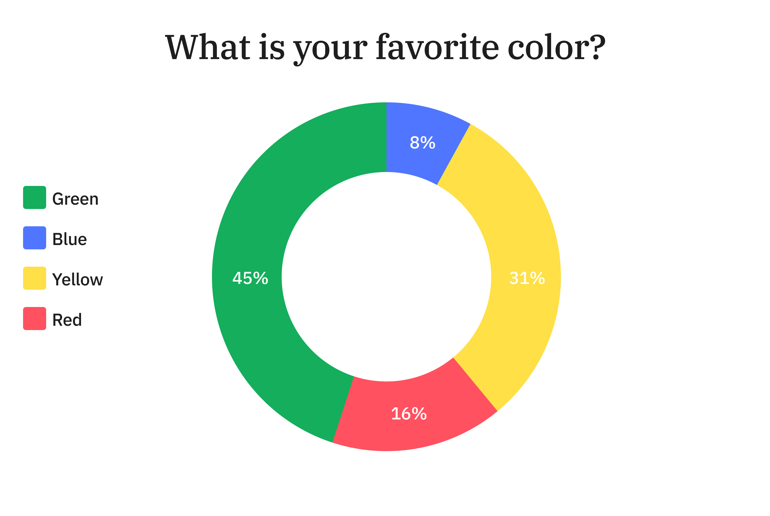
When to Use a Donut Chart
- single choice questions
- mast questions (e.g. Gender, Yes/No)
Donut charts work similarly to pie charts. Donut charts have a circular cutout in the middle whereas the shares within pie charts completely fill out the middle.

Despite these seemingly small differences, the way these chart types are viewed and interpreted from a psychological standpoint vary substantially. Shares of a pie chart all run to the middle and focus a viewer's attention to the centre where all pieces are processed as by the size of their areas. Shares of a donut chart however focus the viewer's attention to the length of each piece, thereby demonstrating a more linear approach of processing results. The latter way of interpreting data is naturally easier for people.
Apart from that, donut charts can be used in the same way as pie charts, i.e., assessing shares of a whole.
When to Use a Bar Chart
- single choice questions
- multiple choice questions
- arrays
- mask questions (e.g. Gender, Yes/No)
There are several different ways to visualise data with bar charts. Most commonly used are the vertical and the horizontal bar charts. Both vertical and horizontal bar charts are composed of columns which are either aligned vertically or horizontally to the x-axis respectively. Furthermore, they are suitable to visualise nominal and ordinal data.
The vertical bar chart is helpful when displaying percentages or means of only a few categories.
Otherwise, too many categories would increase the width of the entire chart across a screen and make it hard to read or even display. The rule of thumb here is to reduce the categories included in a vertical bar chart to only about a handful.

Compared to pie charts, bar charts facilitate direct comparison between categories, especially when ordinal data is arranged from largest to smallest column or vice versa. Furthermore, bar charts can easily display negative values which is impossible with pie charts and makes the former superior and more flexible in most cases.
The horizontal bar chart comes in handy where the vertical bar chart falls short. If you have more than a handful of categories, select the horizontal bar chart as it extends vertically and improves readability.

Stacked and grouped bar charts are great solutions when displaying subcategories, i.e., break down categories for a more detailed view of your data. The only difference between stacked and grouped bar charts is the way subcategories are displayed, namely subcategories in the same bar versus in different bars.
General Tip: Make sure to display your bar labels horizontally, otherwise viewers have to tilt their heads to read them. Also, don't include the answer option "Other" for the same reason disclosed for pie charts.
When to Use a Line Chart
- Single choice questions
- Multiple choice questions
- Arrays
- Mask questions (e.g. Gender, Yes/No)
Line charts consist of data values that correspond to individual answer options and are best used to display trends, comparisons or peaks over time, therefore are great when running surveys repeatedly.

General Tip: Reduce the number of labels on the x-axis to a maximum such as 5 to ensure readability; however, make sure to have enough data points to enable proper extraction of trends. Also, adjust the relative height of the y-axis to match your highest value point within the line chart to improve the visual appeal of the chart. Furthermore, do not include the answer option "Other" for the same reason disclosed for pie charts.
Chart Types in LimeSurvey
Not to worry though, in the statistics overview after collecting survey responses, you can simply and flexibly switch back and forth between all available chart types.
Besides bar, pie, donut and line charts, LimeSurvey offers a few more chart types that are not as mainstream: radar (spider) chart and polar chart.
Radar charts are a great way of visualising multivariate data, i.e., data with multiple variables, on two dimensions while the variables are represented by axes starting from the same point. Thus, radar charts are beneficial when other chart types such as bar charts become rather cluttered with an increasing number of variables.

Polar charts are essentially radar charts since both display data as circular graphs and can be used nicely for visualising multivariate data. However, while radar charts connect the variable results to a "web", the polar charts display results in adverse bars within the circular diagram.
General Tip: Keep the number of variables in your radar or polar chart to a maximum number of 8 to avoid chart overload and confusion.
Advanced Tip: If you are dealing with large amounts of survey data in general, we recommend you consider creating pivot tables to get more efficient and structured data filtering options when generating flexible and powerful pivot charts.
Conclusion
It is always important for you to consider that your audience may not be familiar with the survey setup, i.e., structure, variables and items in detail, which makes it essential to facilitate the readability and interpretation of your survey results by choosing the most suitable chart to get your point across.
Always remember: There is no one right chart to visualise your survey data. It ultimately comes down to weighing the pros and cons of each chart.