Tipo de pregunta - Lista (Desplegable)
From LimeSurvey Manual
Descripción general
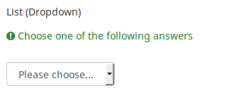
Este tipo de pregunta recopila información de un menú de lista desplegable. También puedes crear subcategorías dentro de esta lista haciendo uso del atributo "Separador de categorías".

Ejemplo: List dropdown question.zip
Opciones generales
Pantalla
Answer order (answer_order)
Description
This attribute allows to set the order of answer options. (New in 5.5.0 build 221219)
Available options
- Normal (default)
- Alphabetically
- Random - Randomize when participant enters survey
Example
See this example (outside link) to better understand how to use different LimeSurvey randomization features.
Label for 'Other:' option (other_replace_text)
Description
Short text string to replace the text "Other" as label for the "other" option.
Example
Entering a value of "Alternative:" for this attribute would result in the word "Alternative:" being used instead of "Other".
Position for 'Other:' option (other_position)
Description
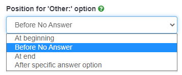
Indicates where the 'Other' option should be placed in the answer list, in relation to the answer options.
Options
- Before No Answer: The 'Other' option shall be placed in the answer list before the 'No Answer' answer option.
- At End: The 'Other' option shall be place at the end of the answer list.
- After specific answer option: The 'Other' option shall be placed in the answer list after a specific answer options which shall be set in the attribute Answer code for 'After specific answer option'.
Height of dropdown (dropdown_size)
Description
The List dropdown questions types contain the "heigh of dropdown" attribute, which allows you to control how many list items are visible to the respondents without scrolling down or clicking on the dropdown menu.
Valid values
- Any integer value greater than 0
- Note, if you select a number larger than the length of the list, the list will be sized to show all options
QS:Ayuda imprimible sobre relevancia de la encuesta
Prefix for list items (dropdown_prefix)
Description
The following attribute can be located under the display option of the List dropdown question type. It allows you to use a prefix (before each list option) for easier keyboard-based selection.
Available options
- None
- Order - like 3)
Lógica
'Other:' comment mandatory (other_comment_mandatory)
Description
It only applies to mandatory questions having an "other answer" option in which the participant can give a free text response ("other comment").
When this setting is activated and the participant selects the other answer (the "other checkbox" or "other answer in a list"), then he will have to give a comment in the "Other comment" input box in order to proceed to the next page.
Note that this option is not available for Multiple Choice questions because the "Other" checkbox status is not recorded in the database for this question type, only the content being recorded. This means that checking the "other" checkbox is just a visual effect that is only meaningful if the text box is filled in: that is why other_comment_mandatory is assumed to be set for this question type.
Available options
- On
- Off (default)
Example
If activated for a "Multiple options with comments" question and the user enters a value in the left part of the Other answer but doesn't enter text in the Other Comment part, a warning message will be displayed when he tries to proceed to the next page.
Question validation equation (em_validation_q)
Description
This is an equation that is used to validate the entire question (e.g, all of its parts collectively for a multi-answer question). If the question fails the validation criteria, then em_validation_q_tip message will be displayed (it uses the CSS style .error). This tip uses the .em_q_fn_validation CSS style, which is hidden by default within template.css.
The main difference between this feature and the subquestion validation equations (em_validation_sq option) is that for this feature, if the question (or question parts) fail validation, then an error message could be shown. For the subquestion validation, each text entry cell (e.g., in an array question type, but it can also be applied to single entry question types) will be styled so that the background color is (light) red.
Valid values
- Any equation that makes use of the ExpressionScript syntax, without surrounding curly braces.
Example
- You want to collect demographic information from users via a multiple short text question, and you want to validate that the user has entered a valid email address and phone number.
This example shows how the question looks with invalid answers:

And here is what it looks like with one invalid answer:

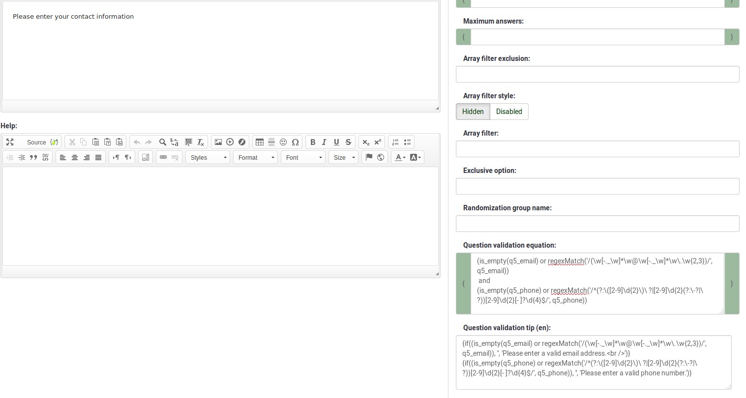
Here is how you edit a question to enter that information:

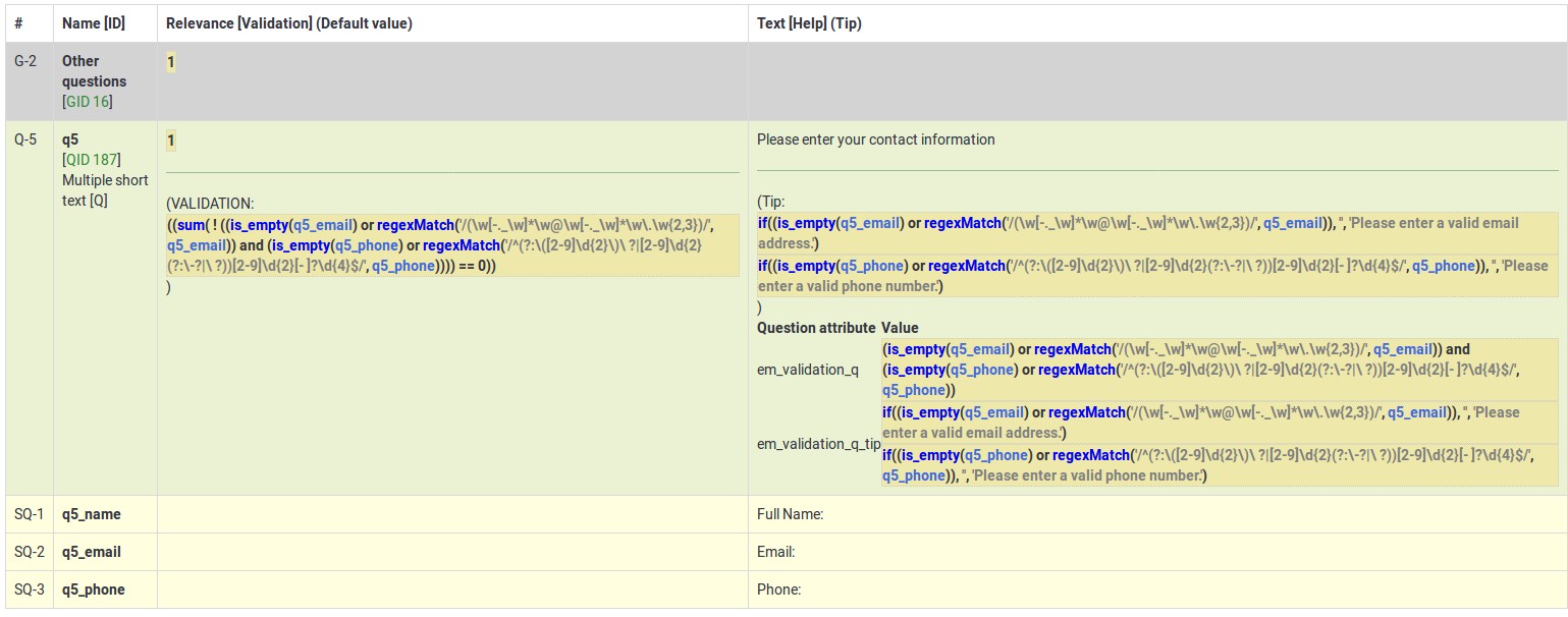
And here is part of the Show Logic File output that lets you check the accuracy of your expression and ensure that there are no syntax errors:

As you can see, the validation equation tests that both the email and phone number are either empty or match a regular expression filter.
The validation tip only shows the warning message if the phone or email appears invalid.
If you wish to import the example from above into your LimeSurvey installation, download the following .lsq file: Em_validation_q_example.zip.
Tip for whole question validation equation (em_validation_q_tip)
Description
If you are using the question validation equation, you can use this box in order to display an optional message as question tip on how the question has to be filled out.
Valid values
- Any string or equation that makes use of the ExpressionScript syntax.
Example
See the example from the question validation equation wiki section- it shows how the tip can be tailored to show which parts of a multiple short text question fail the validation criteria.
Otro
SPSS export scale type (scale_export)
Description
This is used for SPSS export only. This attribute overrides the default scale guessed by SPSS. To learn what the different measurement scales do, please read the related SPSS documentation.
Available options
- Default (default)
- Nominal
- Ordinal
- Scale
Estadísticas
Display chart (display_chart)
Description
This attribute allows the survey administrator to choose if a chart that contains the question results should be displayed to the survey participants after they filled out the survey.
- public statistics survey setting from the presentation & navigation settings
- show graphs survey setting from the presentation & navigation settings
- public statistics question attribute, and
- display chart question attribute.
Available options
- On
- Off (default)
Temporizador
<translate>
<onlyinclude>
Time limit action (time_limit_action)
Description
Sets the action performed when a time_limit has expired. By default the action for a time limit is "Warn and move on", which means the system will give a short warning that the time limit has expired before saving the question and effectively automatically clicking "Next >>". The alternative choices are to:
- "Move on without warning", which automatically clicks the "Next >>" button after the timer is finished but without any warning message.
- "Disable only", which disables changes in the question so the participant can't change anything, but doesn't automatically click the "Next >>" button.
This setting is only applicable if the general time limit setting is activated.
Available options
- Warn and move on (default): will warn the participant that the time has expired, and then click the next button
- Move on without warning: will immediately click the next button after the time limit has expired
- Disable only: will disable the answer after the time limit has expired but not automatically click next
Additional information
Instead of relying on mandatory questions, you may use expressions (read more about question and subquestion validation equations) to make the user not leave empty the answer fields. To see how the validation equations work, check the following example.
In the case in which you want to apply a timer to a question group, activate the group-by-group survey mode, set up a question to use the time limit functionality, and choose the warn and move on (default) option as time limit action. Once the question timer expires, the survey will move to the next page.
</translate>
Time limit disable next (time_limit_disable_next)
Description
It allows disabling the "next" button while a time_limit countdown is occurring. Normally, even if the time limit countdown is active, if the participant wants to click "Next" and move on to the next question or question group, they can simply click on the "Next" button (thus cutting short the time spent on the question or question group). By activating this function, the next button will appear greyed out and will not be available until the countdown timer has finished.
This settings is only applicable if the general time limit setting is activated.
Available options
- On - The "Next" button will be disabled until the time limit countdown is complete.
- Off (default)
Time limit disable prev (time_limit_disable_prev)
Description
It allows disabling the "previous" button while a time_limit countdown is occurring. Normally, even if a time limit countdown is active, if the participant wants to click on "Previous" and move to the previous question or question group, they can simply click on the "Previous" button (thus cutting short the time spent on the question or question group). By activating this function, the previous button will appear greyed out and will not be available until the countdown timer has finished.
This settings is only applicable if the general time limit setting is activated.
Available options
- On - the "Previous" button will be disabled until the time limit countdown is complete.
- Off (default)
Time limit countdown message (time_limit_countdown_message)
Description
Write in this field the text message you wish to be displayed in the countdown timer during the countdown. This setting is applicable only if the general time limit setting is activated. If nothing is written, the the field will use the default value: "Time remaining".
Time limit timer CSS style (time_limit_timer_style)
Description
It allows (and overrides the default) css styling used to display the countdown timer. The default style value for this attribute will be used if it does not exist, which is: 'width: 150px; margin-left: auto; margin-right: auto; border: 1px solid #111; text-align: center; background-color: #EEE; margin-bottom: 5px; font-size: 8pt;'.
Any text entered into this attribute will overwrite the entire default css style, so you should ensure that care is taken when entering a value for this attribute. A simple way to hide this is to copy the default style into this attribute and add 'display: none;' to the end.
This settings is only applicable if the general time limit setting is activated.
Time limit expiry message display time (time_limit_message_delay)
Description
This attribute sets how many seconds the time_limit_message is displayed before the time_limit_action occurs. If this attribute is not set, it defaults to a value of 1 (1 second).
This settings is only applicable if the general time limit settings is activated.
Example
time_limit_message_delay: 5 = the message displays for 5 seconds
Time limit expiry message (time_limit_message)
Description
This is the text of the message that appears to the participant when the time_limit has expired. By default, this message is "Your time to answer this question has expired". If the time_limit_action attribute is set to "Move on without warning" this message is not displayed. You can set the CSS style for this text in the time_limit_message_style attribute (see below).
This settings is only applicable if the general time limit settings is activated.
Example
time_limit_message: The time limit on answering this question is now up.
Time limit message CSS style (time_limit_message_style)
Description
It allows (and overrides the default) css styling used to display the time limit message. The default style value for this attribute will be used if it does not exist, which is: 'top: 10px; left: 35%; width: 30%; height: 60px; padding: 16px; border: 8px solid #555; background-color: white; z-index: 1002; text-align: center; overflow: auto'.
Any text entered into this attribute will overwrite the entire default css style, so you should ensure that care is taken when entering a value for this attribute. It is strongly recommended that you re-use the z-index value, or that, at least, the z-index value is higher than that used for the time_limit_warning_message_style attribute (which defaults to 1001).
Example
Set to: top: 10px; left: 35%; width: 30%; height: 60px; padding: 16px; border: 8px solid #555; background-color: black; color: white; z-index: 1010; text-align: center; overflow: auto
Time limit warning message timer (time_limit_warning)
Description
With the help of this attribute, you can set the time (in seconds) when the time_limit_warning_message will be displayed before the time limit expires. Setting a value for this attribute activates the time limit warning message.
This settings is only applicable if the general time limit settings is activated. This setting also exists for a second warning message.
Example
If you set this to '20', then the time limit warning message will appear 20 seconds before the time limit countdown reaches zero.
Time limit warning message display time (time_limit_warning_display_time)
Description
It sets for how long the time_limit_warning_message is displayed before it is removed/hidden from the screen. By default, if the time_limit_warning_message appears, it will remain visible until the countdown timer has completed the countdown. If a value greater than zero is introduced in this field, the message will be hidden after that many seconds.
This setting is applicable only if the general time limit setting is activated. This setting also exists for a second warning message.
Example
time_limit_warning_display_time: 10 = The time limit warning message will disappear 10 seconds after its moment of appearance.
Time limit warning message (time_limit_warning_message)
Description
If set up, it displays the text of the warning message which is displayed for a fixed period of time before a time limit expires. The default text is "Your time to answer this question has nearly expired. You have {TIME} remaining." {TIME} is replaced by a formatted description which represents the amount of time left (i.e. "30 seconds", "1 minute or 5 seconds"). This message only appears if the time_limit_warning attribute exists. You can set from the time_limit_warning attribute when the message (time_limit_warning_message) appears.
This question attribute is only applicable if the time limit setting is activated and you set some text in the time limit warning message field. This setting also exists for a second warning message.
Example
Attention: In {TIME} the time limit to answer question will expire.
Time limit warning CSS style (time_limit_warning_style)
Description
It allows (and overrides the default) css styling used to display the time limit warning message. The default style value for this attribute will be used if it does not exist, which is: 'top: 10px; left: 35%; width: 30%; height: 60px; padding: 16px; border: 8px solid #555; background-color: white; z-index: 1001; text-align: center; overflow: auto'.
Any text entered into this attribute will overwrite the entire default css style for the warning message, so you should ensure that care is taken when entering a value for this attribute. It is strongly recommended that you re-use the z-index value, or that, at least, the z-index value be lower than that used for the time_limit_message_style attribute (which defaults to 1002).
This settings is only applicable if the general time limit setting is activated. This setting also exists for a second warning message.
Example
top: 10px; left: 35%; width: 30%; height: 60px; padding: 16px; border: 8px solid #555; background-color: gray; color: white; z-index: 1001; text-align: center; overflow: auto
Categoría:Tipos de preguntasCategoría:Preguntas de opción única

