- Posts: 10
- Thank you received: 0
Welcome to the LimeSurvey Community Forum
Ask the community, share ideas, and connect with other LimeSurvey users!
Mobile Ansicht bis 991px Breite darstellen
- medflexSurvey
-
 Topic Author
- Offline
- New Member
-

Less
More
1 year 1 month ago - 1 year 1 month ago #241161
by medflexSurvey
Mobile Ansicht bis 991px Breite darstellen was created by medflexSurvey
Bitte helfen Sie uns, Ihnen zu helfen und füllen Sie folgende Felder aus:
Ihre LimeSurvey-Version: Version 5.6.8
Eigener Server oder LimeSurvey-Cloud: Cloud
Genutzte Designvorlage: fruity
==================
Hallo zusammen,
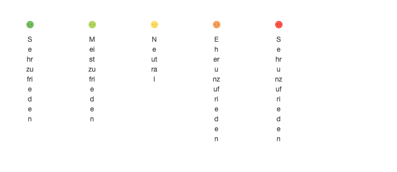
ich habe eine CSAT-Frage mit Smileys umgesetzt und nun festgestellt, dass diese zwischen 768px und 991px Breite sehr unschön dargestellt wird (siehe Attachments). Idealerweise würde bis 991px Breite noch die mobile Ansicht umschalten. Ich habe in der CSS von fruity leider keinen media query zu max-width 991 oder min-width 992 gefunden. Was müsste ich ändern, damit die Frage bis 991px in der mobilen Ansicht bleibt?
Liebe Grüße
Dustin
Ihre LimeSurvey-Version: Version 5.6.8
Eigener Server oder LimeSurvey-Cloud: Cloud
Genutzte Designvorlage: fruity
==================
Hallo zusammen,
ich habe eine CSAT-Frage mit Smileys umgesetzt und nun festgestellt, dass diese zwischen 768px und 991px Breite sehr unschön dargestellt wird (siehe Attachments). Idealerweise würde bis 991px Breite noch die mobile Ansicht umschalten. Ich habe in der CSS von fruity leider keinen media query zu max-width 991 oder min-width 992 gefunden. Was müsste ich ändern, damit die Frage bis 991px in der mobilen Ansicht bleibt?
Liebe Grüße
Dustin
Attachments:


Last edit: 1 year 1 month ago by medflexSurvey.
Please Log in to join the conversation.

- Joffm
-

- Offline
- LimeSurvey Community Team
-

Less
More
- Posts: 12997
- Thank you received: 3999
1 year 1 month ago #241166
by Joffm
Volunteers are not paid.
Not because they are worthless, but because they are priceless
Replied by Joffm on topic Mobile Ansicht bis 991px Breite darstellen
Damit wir etwas mehr sagen können, solltest Du zeigen, wie Du diese Frage implementiert hast.
Also schicke bitte einen lss Export dieser Frage.
Bis dann
Joffm
Also schicke bitte einen lss Export dieser Frage.
Bis dann
Joffm
Volunteers are not paid.
Not because they are worthless, but because they are priceless
Please Log in to join the conversation.
- jelo
-

- Offline
- Platinum Member
-

Less
More
- Posts: 5033
- Thank you received: 1257
1 year 1 month ago - 1 year 1 month ago #241167
by jelo
The meaning of the word "stable" for users
www.limesurvey.org/forum/development/117...ord-stable-for-users
Replied by jelo on topic Mobile Ansicht bis 991px Breite darstellen
Die media queries werden durch das Bootstrap CSS framework festgelegt.
getbootstrap.com/docs/3.3/css/#overview-mobile
Du kannst da dann Teile überschreiben und neue hinzufügen.
Prinzip wird vielleicht mit diesem Thread deutlich.
forums.limesurvey.org/forum/german-forum...nkteauswahl-versehen
getbootstrap.com/docs/3.3/css/#overview-mobile
Du kannst da dann Teile überschreiben und neue hinzufügen.
Prinzip wird vielleicht mit diesem Thread deutlich.
forums.limesurvey.org/forum/german-forum...nkteauswahl-versehen
The meaning of the word "stable" for users
www.limesurvey.org/forum/development/117...ord-stable-for-users
Last edit: 1 year 1 month ago by jelo.
The following user(s) said Thank You: medflexSurvey
Please Log in to join the conversation.
- medflexSurvey
-
Topic Author
- Offline
- New Member
-
Less
More
- Posts: 10
- Thank you received: 0
1 year 1 month ago #241179
by medflexSurvey
Replied by medflexSurvey on topic Mobile Ansicht bis 991px Breite darstellen
Hat nun geklappt mit
@media screen and (max-width: 991px) {
.col-sm-2 {
width: 100%;
}
}
@media screen and (min-width: 992px) {
.col-sm-2 {
width: 20%;
}
}
Danke euch!
@media screen and (max-width: 991px) {
.col-sm-2 {
width: 100%;
}
}
@media screen and (min-width: 992px) {
.col-sm-2 {
width: 20%;
}
}
Danke euch!
Please Log in to join the conversation.
Moderators: Joffm