- Posts: 1
- Thank you received: 0
Welcome to the LimeSurvey Community Forum
Ask the community, share ideas, and connect with other LimeSurvey users!
Prevent change of look on smaller screens
- pilgrimo
-
 Topic Author
- Offline
- New Member
-

Less
More
6 years 6 months ago #160057
by pilgrimo
Prevent change of look on smaller screens was created by pilgrimo
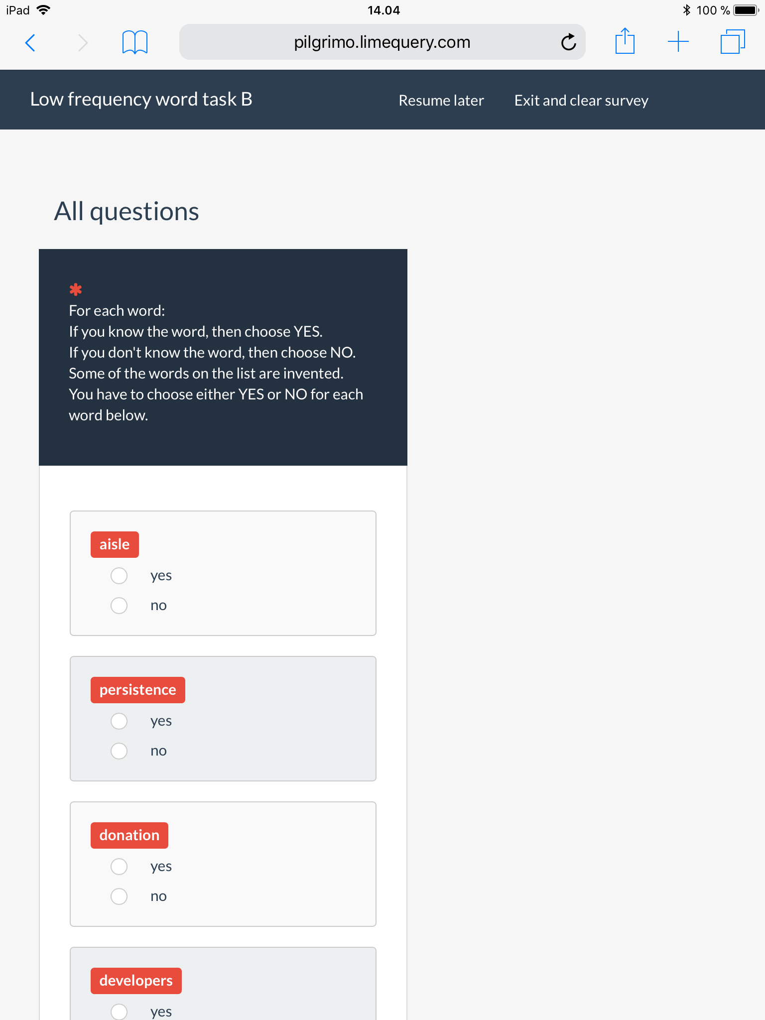
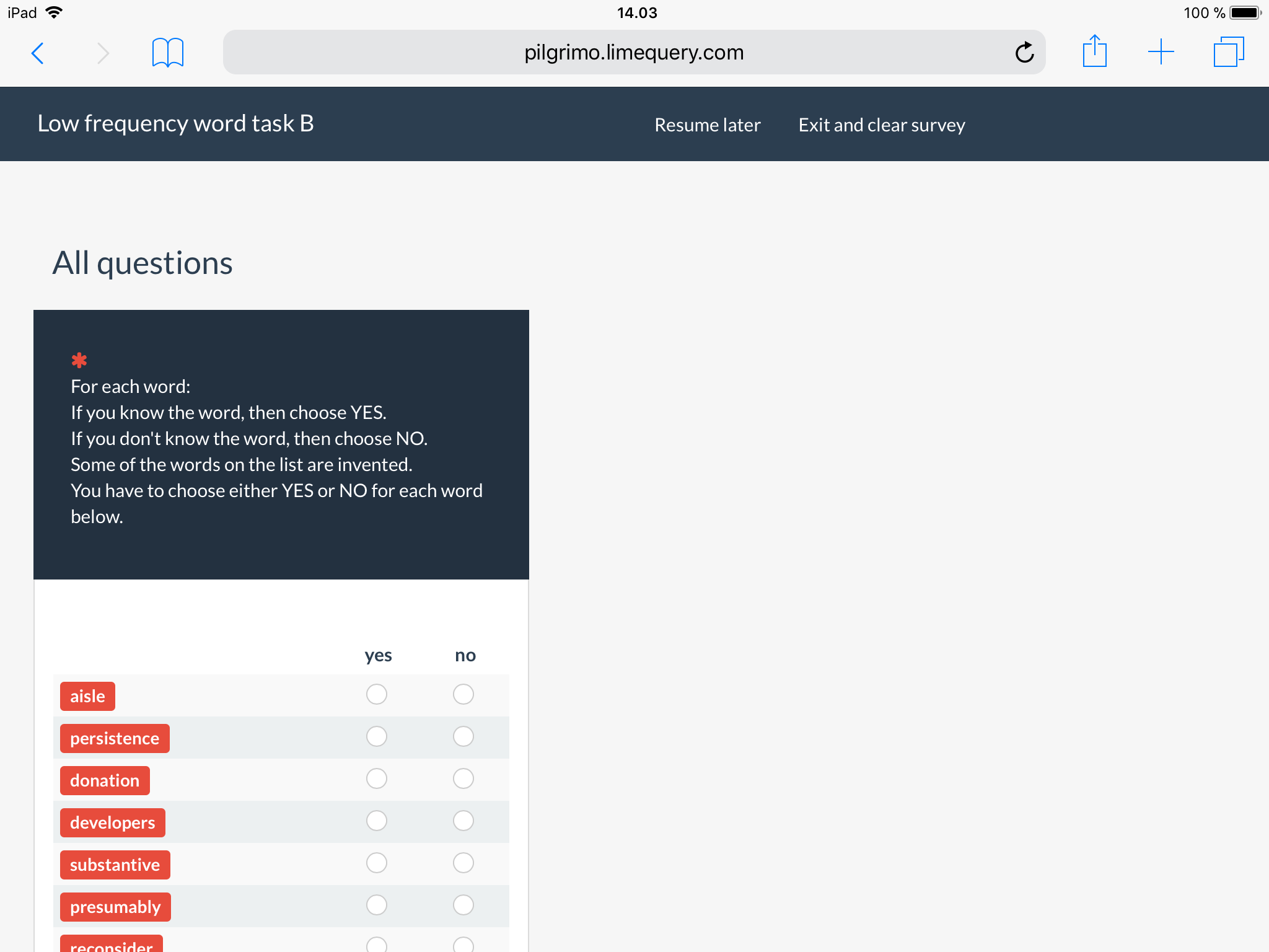
Hi, I was wondering if anyone would be able to help. I have a question array that doesn't require lots of horizontal space. I changed the default template to make the first column more narrow, but didn't make any other changes.
My problem is that e.g. on an iPad (resolution higher than 1024x768) the landscape orientation shows the array in the default view (three columns, in this case), while the portrait orientation uses a different view that destroys the columns and puts each row into a separate "box". I don't understand why, because there is more than enough space for the columns. But whatever the reason, could anyone help me pinpoint the place in the default template that causes this change of layout, or offer a version of the template that wouldn't make this change?
I use the web wersion of LimeSurvey, version 2.72.2.
Thank you!
Attachments:
The topic has been locked.

- Joffm
-

- Offline
- LimeSurvey Community Team
-

Less
More
- Posts: 12941
- Thank you received: 3979
6 years 6 months ago - 6 years 6 months ago #160063
by Joffm
Volunteers are not paid.
Not because they are worthless, but because they are priceless
Replied by Joffm on topic Prevent change of look on smaller screens
Hi, that's because the width where the display cahnges is 801px.
Explanation in "template.css" line 514:
So the behaviour of LS is correct. Vertical display (because of the resolution) and smaller first column.
Regards
Joffm
Explanation in "template.css" line 514:
/**
* No more tables
* OBS: Media specific CSS must be last in this file.
* iPad has width 768px (according to Chrome dev tool)
* Google Nexus 10 has width 800px.
* (Both in portrait mode.)
* We don't have to collapse tables on pads.
*/
@media only screen and (max-width: 801px) {
/*
No more table transformation applies when screen is under 801px (for a few exotic tablet screens, see #11016),
whereas visible-xs-block respect bootstrap standards (767px)
If too many bugs of this kind appears in the future, we should just refuse to support weird exotic tablet screens.
We should repsect standards, we should not try to fit to non standards devices.
*/
So you narrowed the first column, but the above transformation is still there.I changed the default template to make the first column more narrow
So the behaviour of LS is correct. Vertical display (because of the resolution) and smaller first column.
Regards
Joffm
Volunteers are not paid.
Not because they are worthless, but because they are priceless
Last edit: 6 years 6 months ago by Joffm.
The following user(s) said Thank You: DenisChenu
The topic has been locked.
- DenisChenu
-

- Offline
- LimeSurvey Community Team
-
Less
More
- Posts: 13648
- Thank you received: 2491
6 years 6 months ago #160083
by DenisChenu
Assistance on LimeSurvey forum and LimeSurvey core development are on my free time.
I'm not a LimeSurvey GmbH member, professional service on demand , plugin development .
I don't answer to private message.
Replied by DenisChenu on topic Prevent change of look on smaller screens
And to remove this behaviour : remove all this part OR
@media only screen and (max-width: 1px) {
@media only screen and (max-width: 1px) {
Assistance on LimeSurvey forum and LimeSurvey core development are on my free time.
I'm not a LimeSurvey GmbH member, professional service on demand , plugin development .
I don't answer to private message.
The topic has been locked.
- tpartner
-
- Offline
- LimeSurvey Community Team
-
Less
More
- Posts: 10109
- Thank you received: 3595
6 years 5 months ago #160099
by tpartner
Cheers,
Tony Partner
Solutions, code and workarounds presented in these forums are given without any warranty, implied or otherwise.
Replied by tpartner on topic Prevent change of look on smaller screens
If you want to target a single question, you can try adding something like this to the question source:
Code:
<script type="text/javascript" charset="utf-8">
  $(document).ready(function(){
    $('#question{QID} .no-more-tables').removeClass('no-more-tables');
    $('#question{QID} .answer-item .label-text').remove();
  });
</script>
Cheers,
Tony Partner
Solutions, code and workarounds presented in these forums are given without any warranty, implied or otherwise.
The topic has been locked.