- Posts: 10
- Thank you received: 0
Welcome to the LimeSurvey Community Forum
Ask the community, share ideas, and connect with other LimeSurvey users!
Customising the yes/no buttons
- Linoa
-
 Topic Author
- Offline
- New Member
-

Less
More
7 years 7 months ago #142084
by Linoa
Customising the yes/no buttons was created by Linoa
Hi there,
I am customising a template based on the Limesurvey "Default" template, and am trying to modify the yes/no buttons.
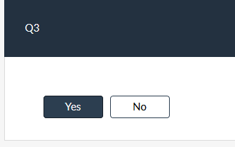
This is what the "default" yes/no buttons look like:

I have modified the css as follow to modify the buttons:
With the following result:

I also wanted to have a space between the 'yes' button and the 'no' button + change the button widths but haven't found how to do this yet.
Anyhow what bothers me most is what the "clicked" button looks like:

We can barely see the difference with the 'unactive' button, there is only a discrete shadow on the yes button. What also happens is that the active button (only the active one) becomes dark grey when the mouse pointer enters the element, but gets white again (with the shadow) when the pointer leaves it.
I have tried to modify the btn-primary:active css which does not work.
Here is the entire 'btn-primary' code in the flat_and_modern.css file:
Would you have any idea what I need to change for the button to remain let's say dark grey (#2c3e50) when we have clicked on it?
Thanks very much for your help,
Linoa
I am customising a template based on the Limesurvey "Default" template, and am trying to modify the yes/no buttons.
This is what the "default" yes/no buttons look like:
I have modified the css as follow to modify the buttons:
Code:
div.yes-no .btn-primary {
    background-color: #FFF;
    color: #000;
    line-height: 10px;
    border-width: 1px;
}
With the following result:
I also wanted to have a space between the 'yes' button and the 'no' button + change the button widths but haven't found how to do this yet.
Anyhow what bothers me most is what the "clicked" button looks like:
We can barely see the difference with the 'unactive' button, there is only a discrete shadow on the yes button. What also happens is that the active button (only the active one) becomes dark grey when the mouse pointer enters the element, but gets white again (with the shadow) when the pointer leaves it.
I have tried to modify the btn-primary:active css which does not work.
Here is the entire 'btn-primary' code in the flat_and_modern.css file:
Code:
.btn-primary {
  color: #ffffff;
  background-color: #2c3e50;
  border-color: #2c3e50;
}
.btn-primary:focus,
.btn-primary.focus {
  color: #ffffff;
  background-color: #1a242f;
  border-color: #000000;
}
.btn-primary:hover {
  color: #ffffff;
  background-color: #1a242f;
  border-color: #161f29;
}
.btn-primary:active,
.btn-primary.active,
.open > .dropdown-toggle.btn-primary {
  color: #ffffff;
  background-color: #1a242f;
  border-color: #161f29;
}
.btn-primary:active:hover,
.btn-primary.active:hover,
.open > .dropdown-toggle.btn-primary:hover,
.btn-primary:active:focus,
.btn-primary.active:focus,
.open > .dropdown-toggle.btn-primary:focus,
.btn-primary:active.focus,
.btn-primary.active.focus,
.open > .dropdown-toggle.btn-primary.focus {
  color: #ffffff;
  background-color: #0d1318;
  border-color: #000000;
}
.btn-primary:active,
.btn-primary.active,
.open > .dropdown-toggle.btn-primary {
  background-image: none;
}
.btn-primary.disabled:hover,
.btn-primary[disabled]:hover,
fieldset[disabled] .btn-primary:hover,
.btn-primary.disabled:focus,
.btn-primary[disabled]:focus,
fieldset[disabled] .btn-primary:focus,
.btn-primary.disabled.focus,
.btn-primary[disabled].focus,
fieldset[disabled] .btn-primary.focus {
  background-color: #2c3e50;
  border-color: #2c3e50;
}
.btn-primary .badge {
  color: #2c3e50;
  background-color: #ffffff;
}
Would you have any idea what I need to change for the button to remain let's say dark grey (#2c3e50) when we have clicked on it?
Thanks very much for your help,
Linoa
Attachments:
The topic has been locked.

- tpartner
-
- Offline
- LimeSurvey Community Team
-

Less
More
- Posts: 10108
- Thank you received: 3593
7 years 6 months ago - 7 years 6 months ago #142233
by tpartner
Cheers,
Tony Partner
Solutions, code and workarounds presented in these forums are given without any warranty, implied or otherwise.
Replied by tpartner on topic Customising the yes/no buttons
Add something like this to the end of template.css:I also wanted to have a space between the 'yes' button and the 'no' button + change the button widths but haven't found how to do this yet.
Code:
.btn-group-justified {
  max-width: 200px;
  border-spacing: 10px;
}

div.yes-no .btn-primary {
  border-radius: 4px !important;
}
Add something like this to the end of template.css:We can barely see the difference with the 'unactive' button...
Code:
div.yes-no .btn-primary {
  background-color: #FFF;
  color: #000000;
  line-height: 10px;
  border-width: 1px;
}

div.yes-no .btn-primary:hover {
  background-color: #F0F0F0;
  color: #000000;
}

div.yes-no .btn-primary:active,
div.yes-no .btn-primary.active {
  background-color: #2C3E50;
  color: #FFFFFF;
  box-shadow: none;
}
Cheers,
Tony Partner
Solutions, code and workarounds presented in these forums are given without any warranty, implied or otherwise.
Attachments:
Last edit: 7 years 6 months ago by tpartner.
The following user(s) said Thank You: Linoa
The topic has been locked.
- Linoa
-
Topic Author
- Offline
- New Member
-
Less
More
- Posts: 10
- Thank you received: 0
7 years 6 months ago #142602
by Linoa
Replied by Linoa on topic Customising the yes/no buttons
Hi tpartner,
Sorry for my late answer, I did not receive the notification.
Have just seen your message and have just tried it, it works perfectly, thanks so much for your help!
Linoa
Sorry for my late answer, I did not receive the notification.
Have just seen your message and have just tried it, it works perfectly, thanks so much for your help!
Linoa
The topic has been locked.